Have you ever tried to buy something online through your mobile phone, and became so frustrated that you just gave up? You’re not alone. Many online shoppers abandon their carts because the mobile shopping experience is cumbersome and inefficient. As mobile commerce continues to grow, it’s crucial for WooCommerce store owners to optimize their sites for mobile users.

Let’s explore the best practices for creating a seamless mobile shopping experience that boosts engagement and conversions.
Importance of Mobile Optimization
Mobile optimization is no longer optional; it’s a necessity. With more consumers shopping on their smartphones, a mobile-friendly store can significantly enhance user experience and increase sales. Google’s mobile-first indexing also means that mobile optimization is critical for SEO. A well-optimized mobile store ensures that users can browse, shop, and checkout effortlessly, leading to higher satisfaction and loyalty.
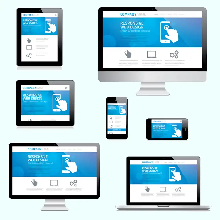
Must-Have: Responsive Design
Responsive design is the foundation of mobile optimization. It ensures that your WooCommerce store looks and functions well on all devices, from desktops to smartphones. Choose a responsive WooCommerce theme that automatically adjusts to different screen sizes. Test your site across various devices to ensure that all elements, including images and text, are displayed correctly.
Streamlined Mobile Navigation
Easy navigation is vital for a positive mobile shopping experience. Simplify your mobile navigation menu by using clear, concise labels and limiting the number of menu items. Implement a sticky menu that stays at the top of the screen as users scroll. Use collapsible menus to save space and improve accessibility.
Optimizing Images and Media
Images and media can significantly impact mobile site performance. Optimize images by compressing them without losing quality using tools like TinyPNG or WP Smush. Use appropriate image sizes and formats to ensure quick loading times. Consider using lazy loading to delay the loading of off-screen images until the user scrolls to them.
One of the most effective ways to optimize your WooCommerce store for mobile users is by using WebP images. WebP is a modern image format that provides superior compression compared to traditional formats like JPEG and PNG, resulting in smaller file sizes without compromising quality. This reduction in file size leads to faster loading times, which is crucial for keeping mobile users engaged. By converting your store’s images to WebP, you can significantly enhance performance and deliver a smoother, more responsive shopping experience for your customers. Implementing WebP images can be easily achieved using plugins and tools that support this format, ensuring a hassle-free optimization process.
Example Images
As you can see, the quality is the same between all three formats, but the file size is much different.
PNG: 63kb

JPG: 11kb
WEBP: 3kb
Simplifying the Checkout Process
A complicated checkout process is a major cause of cart abandonment. Simplify the mobile checkout experience by reducing the number of steps required to complete a purchase. Use one-click checkout options, enable auto-fill forms, and allow guest checkouts. Ensure that the checkout buttons are easily accessible and clearly visible.
Mobile Payment Options
Offering multiple mobile payment options enhances convenience for shoppers. Integrate popular mobile payment gateways like Apple Pay, Google Pay, and PayPal into your WooCommerce store. Mobile payment options not only speed up the checkout process but also build trust and credibility with your customers.

Improving Mobile Site Speed
Site speed is critical for retaining mobile users and improving SEO. Optimize your mobile site speed by using caching plugins, minifying CSS and JavaScript files, and enabling Gzip compression. Tools like GTmetrix and Google PageSpeed Insights can help you identify and fix speed issues. Additionally, consider using a content delivery network (CDN) to distribute your site’s content more efficiently.
Touch-Friendly Interactions
Designing touch-friendly elements is essential for mobile usability. Ensure that buttons, links, and forms are large enough to be easily tapped without errors. Avoid placing interactive elements too close together to prevent accidental clicks. Incorporate touch gestures and interactions, such as swipe navigation, to enhance the user experience.
Testing and Monitoring Mobile Performance
Regular testing is crucial for maintaining an optimized mobile store. Use tools like Hubspot’s Website Grader or Mobi.Ready to check your site’s compatibility with mobile devices. Monitor performance metrics and user behavior using analytics tools. Regularly review and update your mobile optimization strategies based on the data and feedback you collect.

Wrapping Up
Optimizing your WooCommerce store for mobile shoppers is essential for providing a seamless shopping experience and boosting conversions. By implementing these best practices, you can ensure that your store is mobile-friendly, fast, and easy to navigate. Start prioritizing mobile optimization today and watch your engagement and sales soar.